Brief
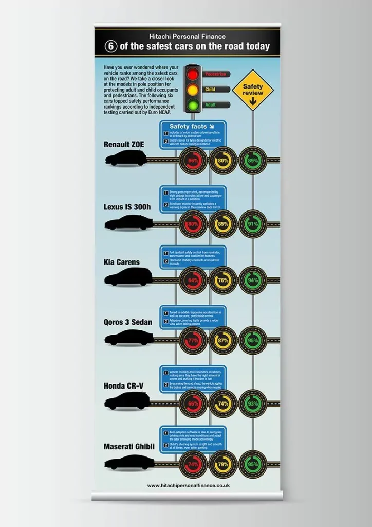
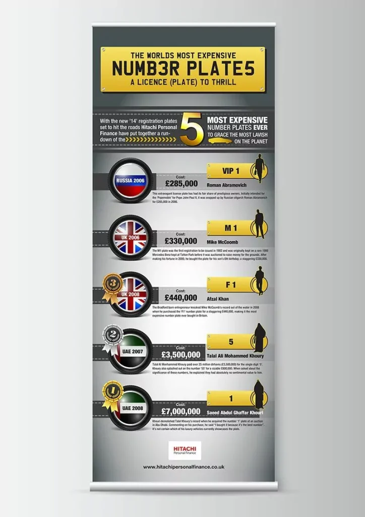
The first infographic compared everyday vehicles to help consumers better understand safety, value and market positioning. The second took a lighter angle, exploring the world’s most expensive personalised number plates and the extraordinary prices attached to them. The challenge was to turn automotive information into exhibition graphics that felt informative, accessible and visually engaging.
Solution
Both infographics were designed entirely in Illustrator and built around custom vehicle illustrations and automotive visual elements. The approach combined structured information design with a more engaging visual style, helping the content feel more dynamic and easier to absorb in an exhibition setting.
Outcome
The result was a pair of automotive infographics that translated data into clearer and more memorable exhibition pieces, showing how information design can make specialist or unusual topics more engaging for a wider audience.